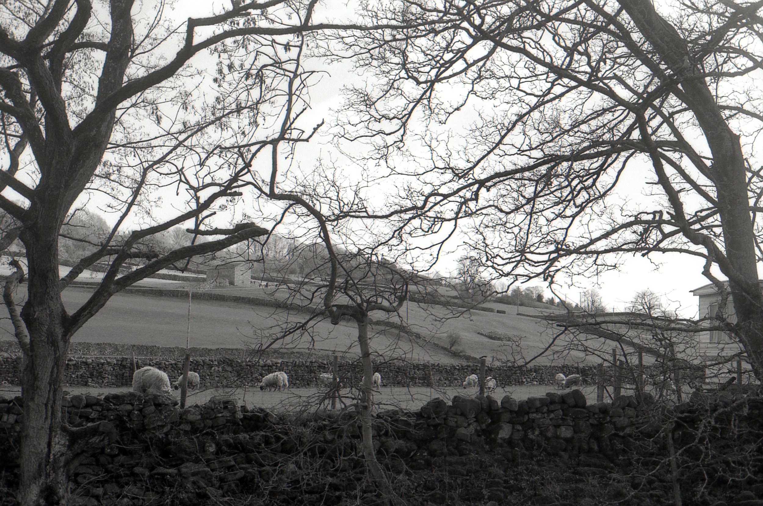
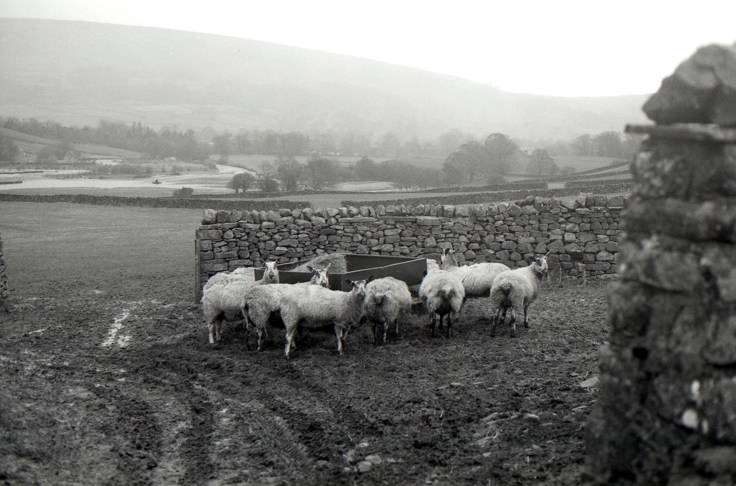
Have I ever told you that I love sheep? I know I’ve shared sheep photos before, but have I ever specifically mentioned that I love sheep? I don’t remember. But if you didn’t know - then you know now haha. I don’t even know what it is about them, but Spring with all the lambs - I love it. Though the lambs were too little when we were in Reeth this time and all in the farms rather than out in the Dales.
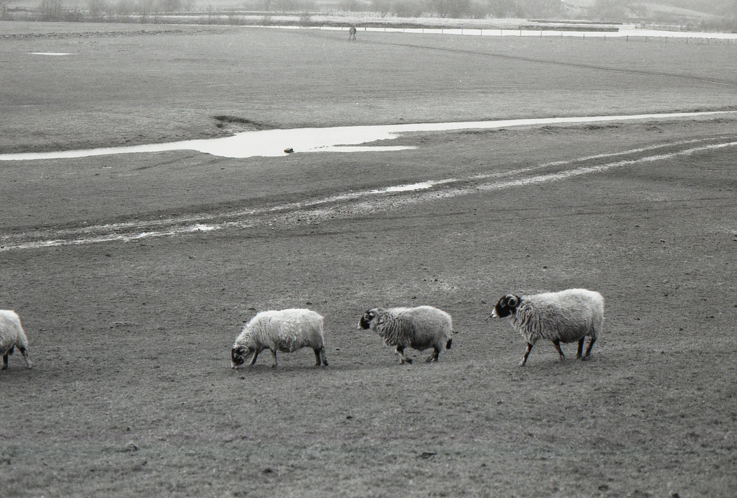

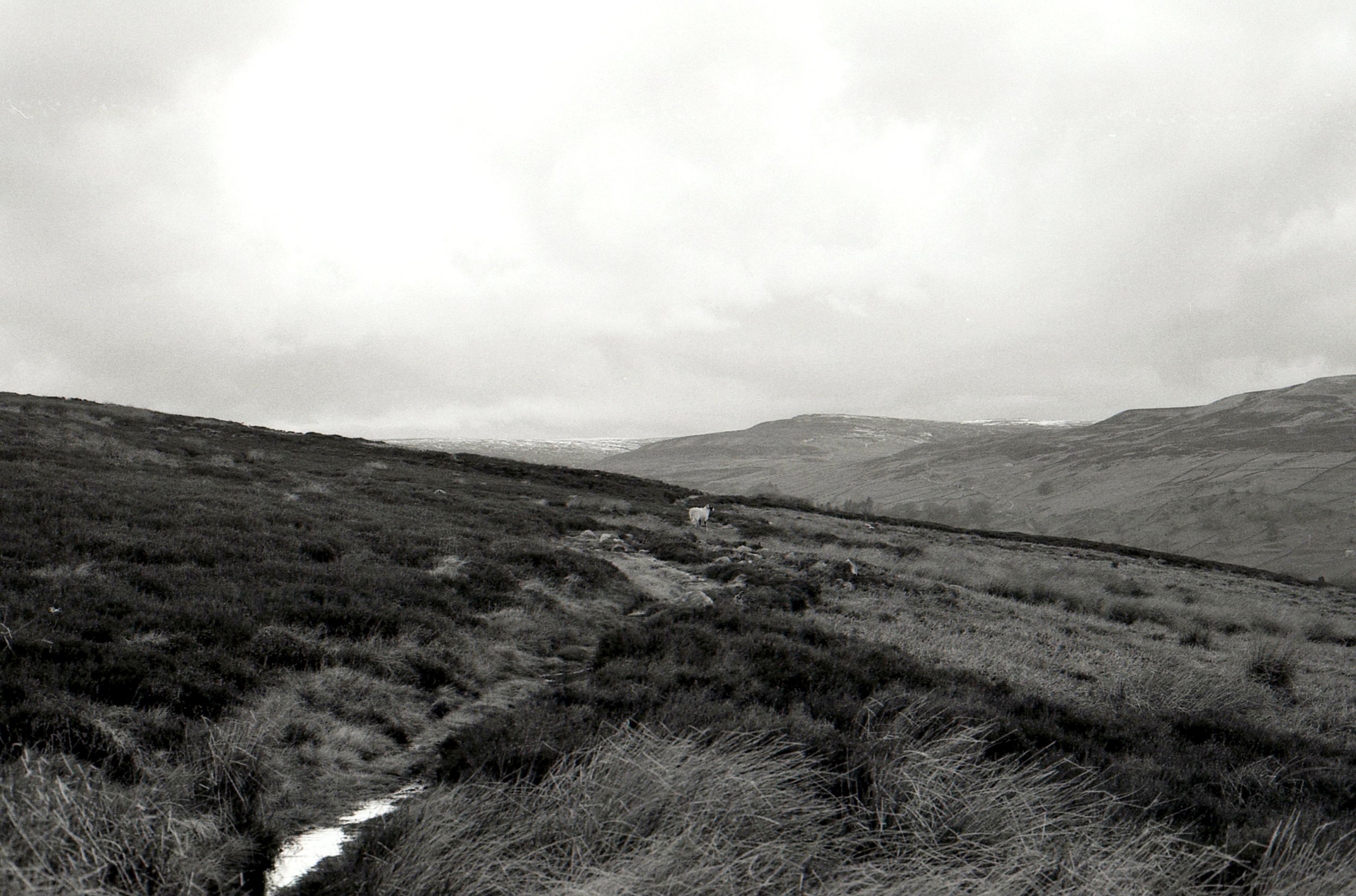
Can you spot the sheep in the last photo? It looked much closer in real life, so I’m a bit sad its so small here but its still pretty cool.
Film: Kodak T-Max 400 - sent to me by Kodak Alaris and developed by The Latent Image (not for free, I would just highly recommend them)
Camera: Canon EOS 750
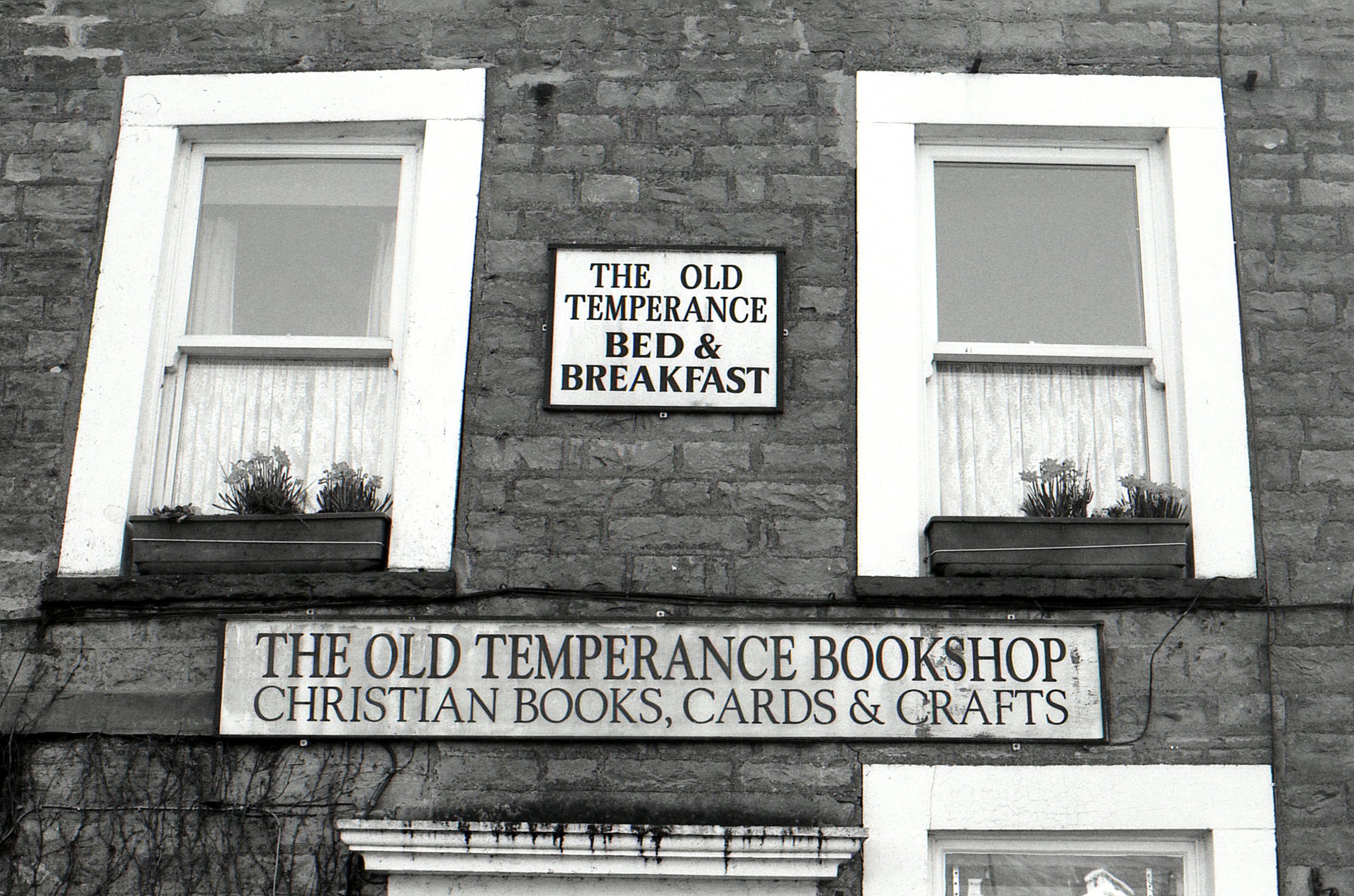
Location: Reeth, Yorkshire Dales